Matplotlib plotting styles
This blog is generated from notebook. Please go to here to get a better reading experience.
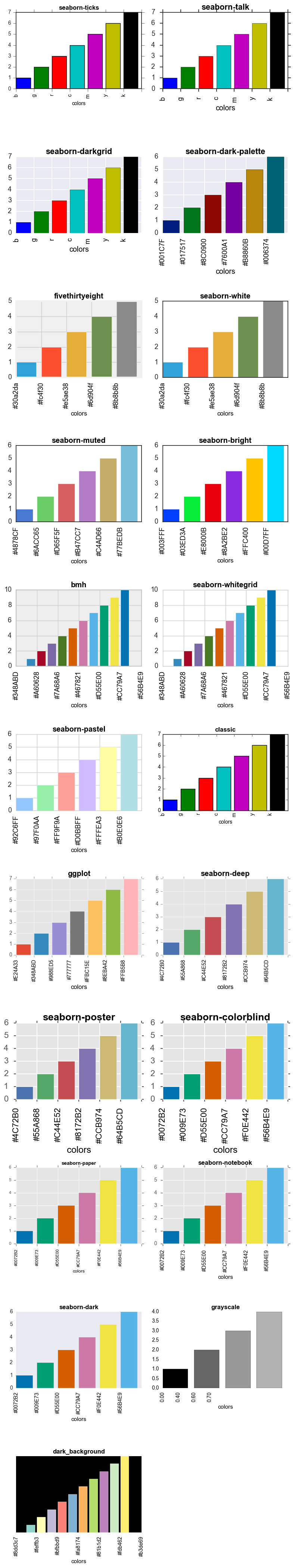
Matplotlib plot styles overview
The default style of matplotlib doesn’t look good. Fortunately, matplotlib supplies more sytles since 1.4.3. The version I’m using is 1.5.1, which has more styles to choose.
To check the matplotlib version:
In [1]:
import matplotlib
print('matplotlib version', matplotlib.__version__)
print()

import sys
print ('Python version', sys.version)
matplotlib version 1.5.1
Python version 3.5.1 (default, Dec 20 2015, 12:06:42)
[GCC 4.2.1 Compatible Apple LLVM 7.0.2 (clang-700.1.81)]
In order to have a more intuitive understanding of different styles, I will list all the styles available, and draw bar charts with each style. In each bar chart, we draw the bars with the colors in the current style.
First, import related libraries, matplotlib and numpy.
In [2]:
%matplotlib inline

import numpy as np
import matplotlib.pyplot as plt
Then, we can list and print all the available styles:
In [3]:
styles = plt.style.available
count = len(styles)
styles
['seaborn-ticks',
'seaborn-talk',
'seaborn-darkgrid',
'seaborn-dark-palette',
'fivethirtyeight',
'seaborn-white',
'seaborn-muted',
'seaborn-bright',
'bmh',
'seaborn-whitegrid',
'seaborn-pastel',
'classic',
'ggplot',
'seaborn-deep',
'seaborn-poster',
'seaborn-colorblind',
'seaborn-paper',
'seaborn-notebook',
'seaborn-dark',
'grayscale',
'dark_background']
For different styles, the colormaps are different, create a method to get the colors:
In [4]:
def get_colors():
    return plt.rcParams['axes.prop_cycle'].by_key()['color']
Create a method to set the face color of different bars in a bar chart:
In [5]:
def set_facecolor(rects):
    colors = get_colors()
    ncolor = len(colors)
    for index, rect in enumerate(rects):
        color = colors[index%ncolor]
        rect.set_facecolor(color)
Then, create a figure, set the height according the count of styles. Here we want to plot all the different styles into 2 columns subplots, so we devide the height with 2.
For each bar chart, we set the x ticks lables with the color value, and set the title with the style name.
use tight_layout() to make the layout more beautiful.
In [6]:
fig = plt.figure(0, figsize=(8, 4*count//2))

for index, style in enumerate(styles):
    plt.style.use(style)
    colors = get_colors()

    ax = fig.add_subplot(count//2+1, 2, index+1)

    seq = range(1, len(colors)+1)
    rects = ax.bar(seq, seq)
    set_facecolor(rects)

    ax.set_xlabel("colors", color='black')
    ax.set_xticklabels(colors, rotation='vertical', color='black')
    ax.set_title(style, fontweight='bold', color='black')


fig.tight_layout()
blog comments powered by Disqus