Using matplotlib to analyse Locust results
Forewords
We are using Locust to do performance test. Locust is a scalable load testing framework written in python. It supplies us two brief reports called request report and distribution report. The reports show us some data about the response time, such as average response time per request, medium response time per request,maximum response time per request, RPS (request per second) and distribution of response time with different percentiles.
The main page of performance testing is like this:

The distribution report is like this:

We can get some clues from the reports, which help us to do further performance tuning.
But it is still not enough. There are some server-side performance monitoring tools, such as NewRelic, which can give us many detailed reports. A good example of that is the response time chart, from which we can get the average response time in a certain duration. But it still requires us some time to know about the response trend of a certain request. Actually, Locust collects response time in the client-side, so we can get these information easily.
Why not generate the charts we need just when the performance test finished? Thanks to the gorgeous python 2D plotting library matplotlib, we can make any charts we want quickly.
Let’s go!
Introduction to matplotlib
![]()
“matplotlib is a python 2D plotting library which produces publication quality figures in a variety of hardcopy formats and interactive environments across platforms. matplotlib can be used in python scripts, the python and ipython shell (ala MATLAB®* or Mathematica®†), web application servers, and six graphical user interface toolkits.
–http://matplotlib.org
Before getting hands dirty, let’s follow the convention to start with a “hello, world”-like example.
We use the interactive python - ipython to write the code:
ipython --matplotlib
After started ipython, let’s type in the following codes:
# -*- coding:utf-8 -*-
import matplotlib.pyplot as plt

x = np.random.randn(1000)
plt.subplot(221)
plt.plot(x)
plt.subplot(222)
plt.hist(x)
plt.show()
We will get two charts as followed:
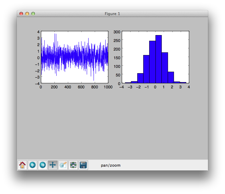
The left one is a plotting chart, the right one is histogram chart. At the bottom of the graph, it is an interactive navigation bar, by which you can navigate through the data set.
Easy enough, Aha?
Generate Locust requests chart
The standard locust requests reports are like this:
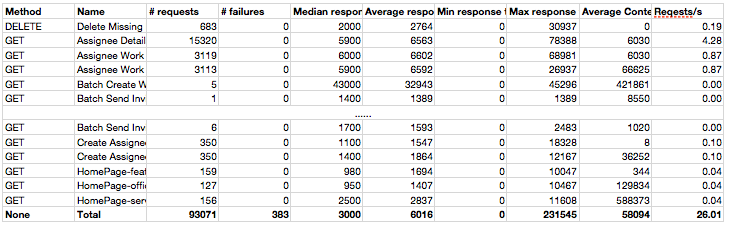
The data is not very visible, and if we want to have a intuitional overview for all the response time, we still need to do some extra work such as sorting.
Why don’t we generate a chart once this report generated? Let’s try how to do it by matplotlib with the following requirements:
- Display the median response time in bar chart.
- Tick the response time with the request name.
- Sorting the items by the response time.
- Show the median response time number along with each bar.
At the beginning, we need to load all the data from the report file. For this, we have no reason to choose numpy, a python library for scientific computing, to do the job.
# -*- coding:utf-8 -*-
from optparse import OptionParser
import os
from os.path import basename

import matplotlib.pyplot as plt
import numpy as np


def autolabelh(rects):
    for rect in rects:
        width = rect.get_width()
        plt.text(width * 1.05, rect.get_y() + rect.get_height() / 2., '%d' % int(width), ha='left', va='center', fontdict={'size': 10})


def generate(file_name, img_file_name):
    data = np.genfromtxt(fname=file_name, dtype=None, delimiter=',', names=True, comments=False, autostrip=True)
    headers = data.dtype.names
    name_header, response_header = headers[1], headers[4]
    sorted_data = np.sort(data, order=[response_header])
    name, median_response_time = sorted_data[name_header], sorted_data[response_header]
    bar = plt.barh(range(len(median_response_time)), median_response_time, align='edge', alpha=0.7)
    plt.yticks(range(len(name)), name, ha='right', va='bottom', size='small')
    plt.subplots_adjust(left=0.3)
    plt.grid(True)
    autolabelh(bar)
    title = os.linesep.join([basename(file_name), response_header.replace('_', ' ').upper()])
    plt.suptitle(title, fontsize=12, weight='bold')
    plt.savefig(img_file_name, bbox_inches='tight')


if __name__ == '__main__':
    parser = OptionParser()
    parser.add_option("-s", "--source", dest="csv_file_name",
                      help="read data from csv file", metavar="FILE")

    (options, args) = parser.parse_args()
    img_file_name = '.'.join([options.csv_file_name, 'png'])
    generate(options.csv_file_name, img_file_name)
Notes:
- We use the numpy lib’s
numpy.genfromtxtto read the CSV file into 2D array. - Use
numpy.sortto sort the data by the median response time. - The
pyplot.barhmethod is to generate a horizontal bar chart. - Use
pyplot.yticksmethod to set the ticks of Y axis with the request names. - Use
pyplot.gridmethod to add grid into the chart. - Use
autolabelhmethod to add value label beside each bar. - Use
pyplot.titlemethod to add a title, and usepyplot.supertitlemethod to add a super title (This title will be shared if there are multiple charts.) - Use
pyplot.savefigmethod to save the chart into a file, the format could be jpg, png, pdf, SVG, etc.
The chart would be like this:
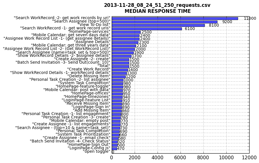
We can see very clear from the chart that there are 4 requests with longer median response time, so we can just focus on these requests to make further diagnosis.
Also, we can get from the chart that the statistical data “Total” also included in the chart. If we do not want it, we can simply skip it when loading the data.
Ok, still simple enough, right? Let’s do something more exciting.
Generate Locust request trend chart
Why we need it?
The motivation that we want the locust request trend is that we found the response time of some requests increasing rapidly when doing test. From the previous report and chart, we can not get the answer. Although we have installed performance monitoring tools in the server side. We can not get the information in a high granularity. Also, we want this information as soon as possible, it is better to let us know that just after we finish the performance test.
How to collect data
If you do not care about how we get the data, you can directly go to the next paragraph. Locust has the ability to record all the responses by adding a hook to the request_success event. The code segments for collecting the data would be like this:
BACK_UP_COUNT = 20
MAX_LOG_BYTES = 1024 * 1024 * 5
events.request_success += success_request
success_handler = RotatingFileHandler(filename=os.path.join(LOG_PATH, filename), maxBytes=MAX_LOG_BYTES*10, backupCount=BACK_UP_COUNT, delay=1)
formatter = logging.Formatter('%(asctime)s | %(name)s | %(levelname)s | %(message)s')
formatter.converter = time.gmtime
success_handler.setFormatter(formatter)
success_logger = logging.getLogger('request.success')
success_logger.propagate = False
success_logger.addHandler(success_handler)
def success_request(method, name, response_time, response_length):
msg = ' | '.join([str(method), name, str(response_time), str(response_length)])
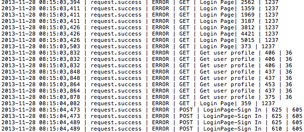
success_logger.error(msg)The data collected should be in the following format:
DATETIME | LOGGER NAME | LOG LEVEL | HTTP METHOD TYPE | REQUEST NAME | RESPONSE TIME | RESPONSE LENGTH
Take a look at the snapshot of the log file:
Requirements and tasking
With these data, we want to find out the following things:
- The response time trend of each request along with the time going.
- The histogram of the request count by time.
- The response time distribution per request.
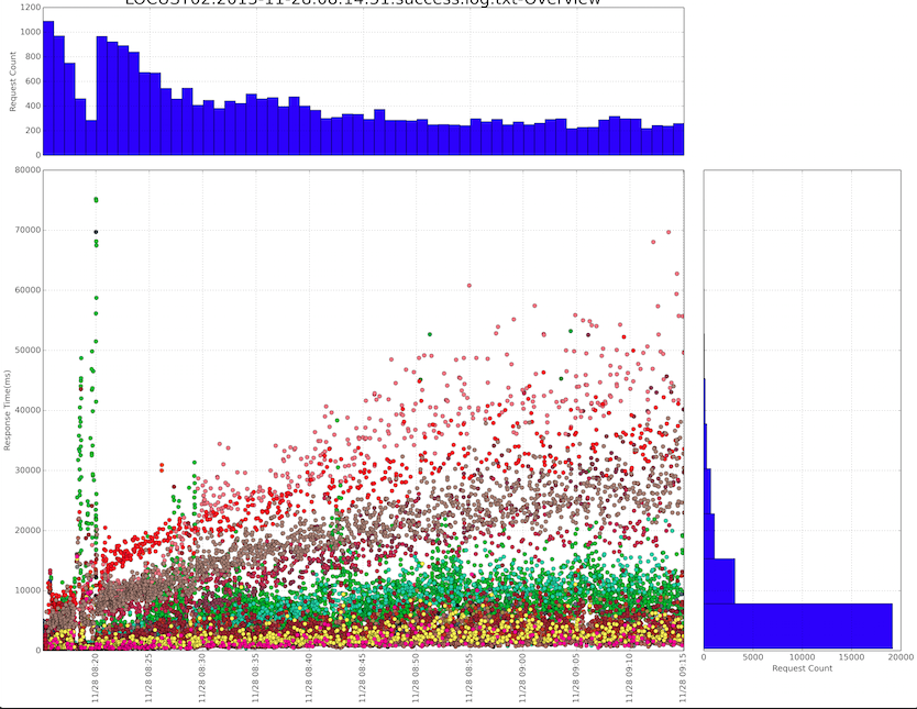
- The overview of the above information in one chart.
So we task the requirements into the following step:
- Find a way for numpy to deal with the datetime and show it along with the axis.
- Group all the requests by name and keep the time order meanwhile.
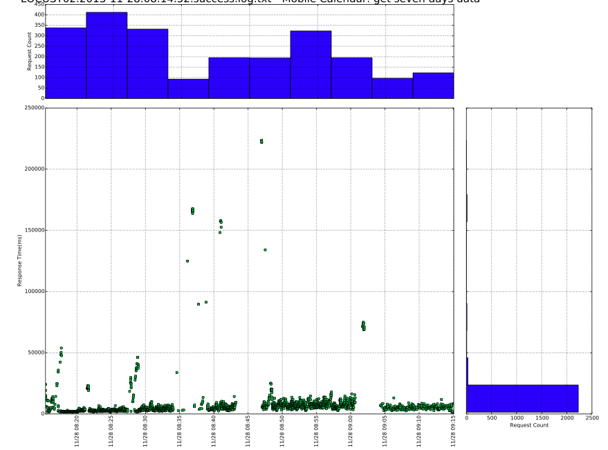
- Draw plots for every request.
- Draw histogram for every request by time.
- Draw histogram for every request by response time.
- Draw overview graph of all the requests in one page, and use different colors to distinguish the requests.
- Gather all the graphs into one PDF file.
Implementation
For task 1, we can deal with the datetime column by passing a converters parameter to the numpy.genfromtxt method. Meanwhile we need to tell it that the type of that column is object, not str:
time_convert_func = lambda x: datetime.strptime(x, '%Y-%m-%d %H:%M:%S,%f')

headers = ['time', 'label', 'loglevel', 'method', 'name', 'response_time', 'size']
        dtype = [(headers[0], 'object')] + [(col, '|S128') for col in headers[1:-2]] + [(col, 'i') for col in
                                                                                        headers[-2:]]
data = np.genfromtxt(fname=filename,
                     delimiter='|',
                     autostrip=True,
                     dtype=dtype,
                     names=headers,
                     converters={'time': time_convert_func},
                     invalid_raise=False)
If we want numpy to skip the invalid lines (sometimes it happens), we need to pass the invalid_raise parameter and set it to False.
For the display format of the datetime, we can set the axis’ formatter with matplotlib’s dates module:
dates.DateFormatter('%m/%d %H:%M')For task 2, we can sort the requests by request name with the numpy.sort method, and then group them with the itertools.groupby method:
sorted_data = np.sort(self.data, order=['name', 'time'])
grouped_names = groupby(self.sorted_data['name'])
For task 3 to task 5, we already have the solution in previous introduction.
For task 6, we only need to draw all the plots in one graph, just need to keep one thing in mind is that the histogram is about all the requests.
For task 7, we have the PdfPages class in the matplotlib to help us implementing it. we can simply add one graph into the PDF file by calling the PdfPages.savefig method.
The overview graph of all the requests might be like this:
The single request graph might be like this:
You can get all sample codes by visiting this link in Github.
Make it automatically
The aim of all the work is to eliminate the time spent on the diagnosis as much as possible. We should add the scripts into the continuous integration system with no doubt. What’s more, it is a much more easier job than the previous ones.
With the graphs, it seems that we even do not need to open and analyse the log anymore. Life is beautiful.
Wrap up
The matplotlib is a powerful library for scientific computing and visualization. If you are look for some tools to present charts, the matplotlib is a good choice. Also, If you are working on data analysis and scientific computation, the numpy1 and pandas2 will help you a lot and save you much time.
blog comments powered by Disqus